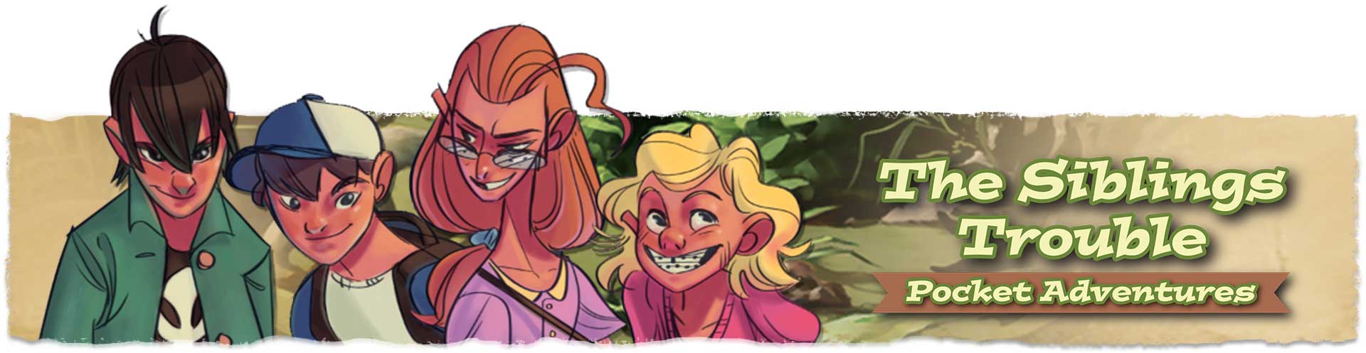
Design Process : A look at The Siblings Trouble
The graphic designer and illustrator for the wonderfully whimsical The Siblings Trouble stops by to share her thoughts and advice on the creative process. I am very grateful to Kim for offering these insights and invite everyone to check out The Siblings Trouble on Kickstarter. I am a backer and can’t wait to get my hands on this game – hope you will consider supporting it as well.
The Siblings Trouble is the first real tabletop game design project I have been a part of. I’ve worked as a graphic designer for nearly 30 years, but the last decade has primarily been projects for the web or video games. Early in my career, I was a packaging designer and as a self-promotional piece, my partner and I designed a board game we called Ventures which we took to the Toy Fair in New York to try and sell. That experience gave me a taste of how to organize and create the art needed for TST, but I’ve learned a lot since then and can share some of the methods I use to stay on top of things and make the process go as smoothly as possible.
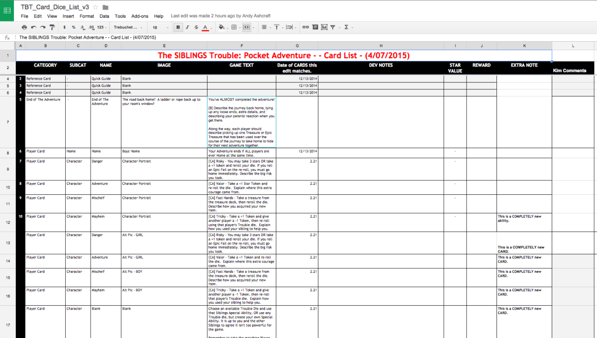
I have always loved games and when Ed approached me about this project, I was eager to help but knew it would be an enormous amount of work. We started in March of 2014, and with the Kickstarter live a year later, I can tell you it’s been a marathon of an experience. From the beginning we’ve used Google Docs to share and update task lists and most importantly a spreadsheet of all 120+ cards. This spreadsheet shows the card type, title, graphic description, body text, star value, and reward, and we have additional columns for comments and questions. When any item is highlighted, it means it needs attention either in the form if revisions or as a point of discussion. It would have been impossible to keep all that detail straight in any other way, and it even eliminates problems with multiple emails and keeping track of discussion threads.
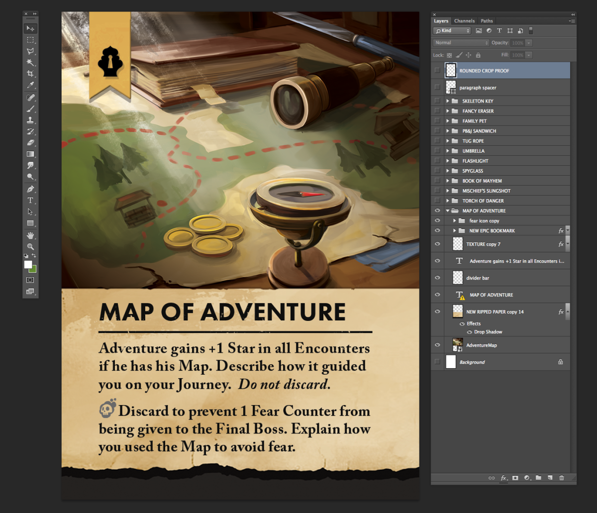
I am not a fan of InDesign even though it is an industry standard for creating multiple page documents. Instead, I use Illustrator and Photoshop exclusively. At first I thought all the cards and components would be created in Illustrator, but Photoshop proved more valuable in keeping all the design elements on each card in the exact same position from one to the next. Plus there’s also a photoshop color wheel feature that’s available and I much prefer it compared to the other color wheels out there. I have a separate file for each card type, and within that, I have a folder for each card.
Epic Treasure file showing Layers Palette in Photoshop
For example, in the Epic Treasure file, there are a dozen folders in the Layers Palette, one for each card in that deck. I set up the first card by copying and pasting the text from our spreadsheet, and adjust it as needed for readability, line length, or for purely aesthetic reasons. Once the first card in the deck is completely designed, I duplicate it, rename accordingly, and edit each of its layers as needed. Because the copy, illustrations, and UI elements are also duplicated from one folder to the next, everything is always exactly where it needs to be. As I complete each card, I turn the highlighted text in our spreadsheet back to white to indicate that I’ve finished that card or item. Believe it or not, when you’re working on this many cards, the simple act of removing the highlight in a spreadsheet is a big help in staying organized.
In order for Ed and Andy to review the work I’ve done, I save png or jpeg files and email them directly. We’ve used Dropbox for this purpose in the past, but it seems to work better using email until any revisions are discussed and resolved.
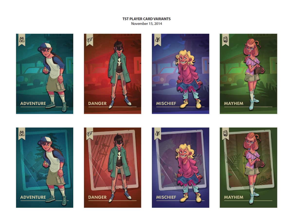
Player Card Front Variations
There are always several rounds of edits, so keeping the Dropbox clean until the artwork is complete keeps the team more organized. Another best practice is to name your files appropriately. For psd’s, I generally use the date in the filename just so I can keep multiples and not have any confusion regarding which version to use. For png or jpeg proofs, I use this convention: “DeckName_CardName_VersionNumber.png”. I tried numbering the cards and filenames, but it ended up being much easier to open and use any of them when I knew immediately which one was which. “HillsideCaves_DarkTroll.png” is easily understandable whereas “HillsideCaves_Card13.png” isn’t. Above all this, I can’t stress enough the value of naming all of your layers in Photoshop. When you have literally thousands to sift through to find a tiny highlight or the right UI element, the layers palette can be your best friend or a mortal enemy. Don’t think this is a waste of time – it’s ultimately going to get your project done more quickly, and if you ever need someone else’s help they’ll appreciate not having to deal with a mess. This is just one tip that I find hugely beneficial regarding photoshop, but actually, there are loads of other tips that can help as well – just check out this article here: https://www.acuitytraining.co.uk/news-tips/how-to-use-the-tools-in-photoshop-cc-2020/.
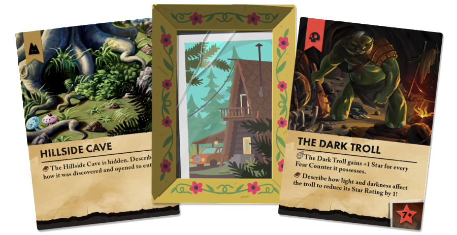
One of the biggest challenges in putting together The Siblings Trouble was the selection of images for our prototypes. For me it’s part pencil sketch, part Google Image Search, and part photo retouch.
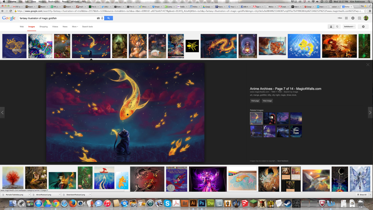
Google Image Search for “Fantasy Illustration of Magic Goldfish”

Version 1 Designs for Mystic Waters Deck, March 2014, including “Magic Goldfish” Card
Ed and Andy used our team spreadsheet to jot down ideas for what they envisioned each card to look like, but sometimes those exact words didn’t make the most compelling or interesting illustration. I’ve gotten really good at seeking out the type of image we want, and with some occasional photo retouch to adjust color or get the image to fit the format better, I have a perfect “sketch” for our illustration team to use as inspiration, and for use in play testing. For all our temporary illustrations, I add in a transparent “FPO” which stands for “For Position Only”.
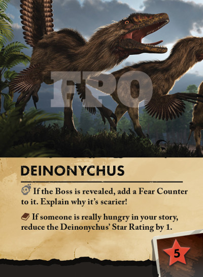
Deinonychus Card from Ancient Forest Deck, showing FPO Watermark
This watermark indicates that we are only using the art we find online until we have a final and original illustration to replace it with. None of our FPO illustrations will remain when we send the game to the printer, and all our team’s original work will be just that – original. The samples are for inspiration only.
The last bit of advise I have is to know upfront that it’s going to be a long road to finish your game. Many changes will occur over time, but always with an eye to improvement. Don’t get discouraged, pace yourself, and ask for help when you need it. If you want another artist to design aspects of your work, you could always Hire a Book Illustrator to give you a hand. I’ve met some incredible people over the course of the last year, and without exception they’ve been supportive and helped to get The Siblings Trouble one step closer to completion. I am grateful to my network of friends and to my awesome family for allowing me to have this experience, and I’m looking forward to getting the game into as many players’ hands as possible.

Dylan and Aidan on an outdoor adventure at Highbanks Metropark, Summer 2011
Cheers,
Kim
Comments are Disabled